Formatting Charts in Excel
Formatting Charts in Excel
by Boxplot Sep 1, 2019
Formatting charts in Excel is no easy task. It’s time-consuming, and Excel is pretty fussy which doesn’t make things easier. In this post I’ll give general tips for formatting charts, and also go over a few common scenarios.
Understand the Parts of a Chart
First thing’s first: it’s important to get the syntax down pat for Excel charts. Here’s what Microsoft calls the various parts of a chart:
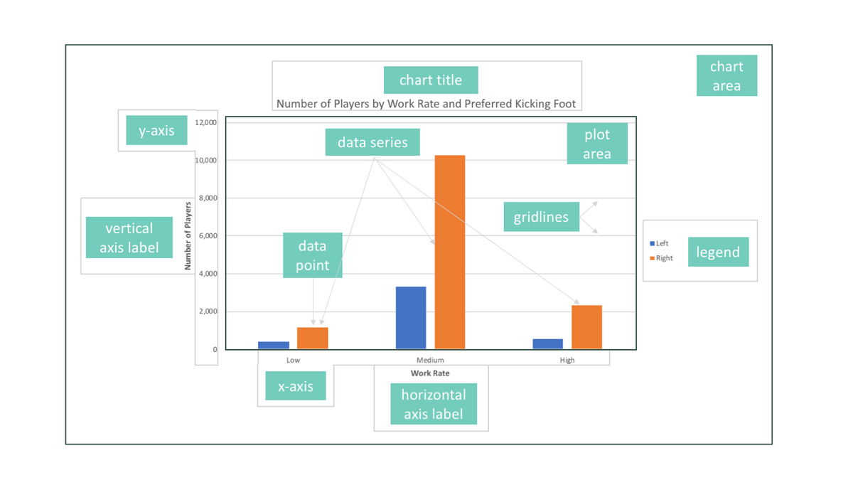
We’ll go through some of these less obvious ones in more detail later in the post (like data series vs. data point) but it’s important to get the general terminology down because when you right-click on a chart, the menu will change depending on where you right-click.
Right-clicking
Most people already know that right-clicking on something, whether it’s a link in a web browser or a chart in Excel, will make a menu of options appear. When right-clicking on charts in Excel, however, it is important to right-click on the *exact* thing that you want to change.
You will get different menus if you right-click in different places on a chart in Excel.
So, if you want to modify the y-axis, you need to right-click directly on the y-axis. Sometimes, you might think you’re clicking on the y-axis, but if it’s not *exactly* on the y-axis, you won’t get the option to modify the axis. It’s tricky! See what happens below when I click in the white space naer the y-axis (between the 800 and 1200) as opposed to when I click directly on the 1200:
it’s different menus! The first time, I got a larger menu with “Format Chart Area” at the bottom of the menu. The second time, I got a smaller menu with “Format Axis” at the bottom of the menu. If I’m trying to change the y-axis, I’d want the second one so I can click on “Format Axis”.
Common Scenarios
Usually, you want the “Format …” option when right-clicking.
Of course this will not be the case 100% of the time, but for the majority of chart changes that people want to make in Excel, the option at the bottom of the menu is what you’re looking for. As I just mentioned, this option will change depending on where you click on the chart – if you right-click on the x or y axis, it will be “Format Axis.” If you right-click on a point on a scatterplot, it will be “Format Data Series.” If you right-click on the white space around the edges of the chart, it will be “Format Chart Area”. That will bring up a window or panel (depending on your version of Excel) that will allow you to add/remove borders, change colors, modify the minimum and maximum axis values, etc. For example, if you are trying to change the color of all the bars in a bar chart, you’d right-click on a bar, all of the bars will become selected, and you’ll choose “Format Data Series”.
To remove the border of a chart, you’d right-click in the white area surrounding the chart, and then choose “Format Chart Area”. Then, under the spill-paint icon, choose “Border” and set it to “No Line”.
Finally, to change the maximum value of the y-axis, right-click on the axis and choose “Format Axis”. Then set the maximum to whatever you want and hit enter:
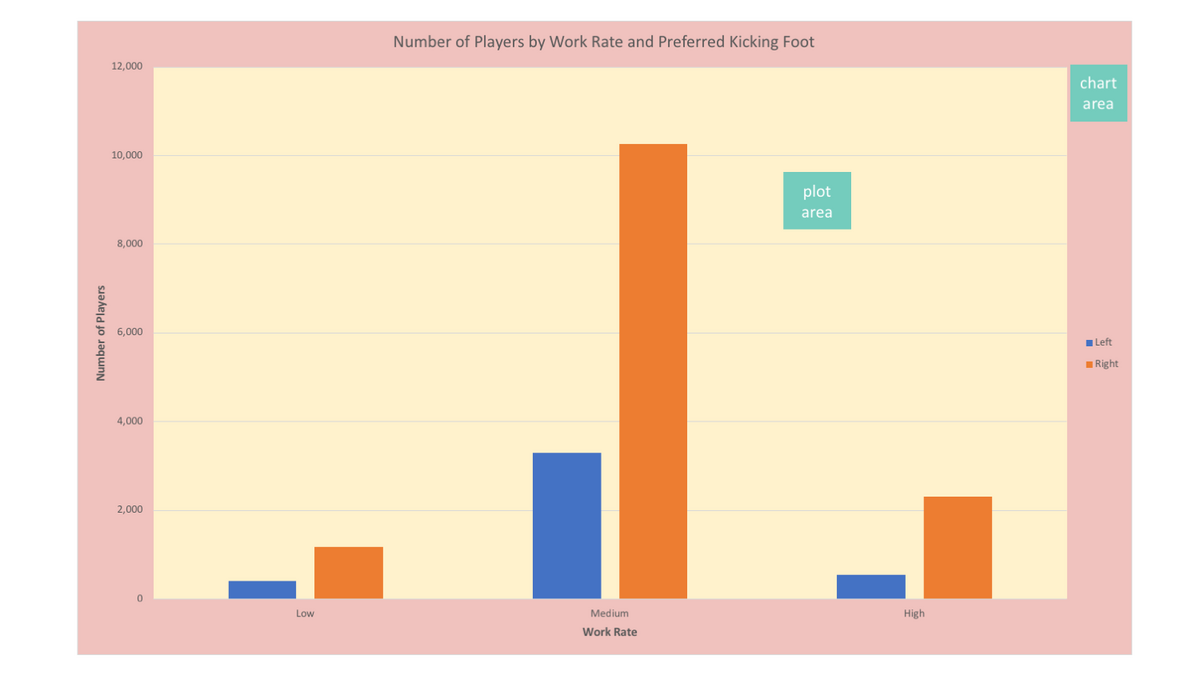
Chart Area vs Plot Area
This has its own section because it is particularly tricky. There is a “chart area” in Excel and a “plot area”. The “plot area” is inside of the chart area. On the figure below, the chart area is the red, and the plot area is the yellow:
Data Series vs. Data Point
This is even trickier than plot are vs chart area! If you single LEFT CLICK on a bar in a bar chart in Excel, you will select the entire “Data Series”. That is, every bar of that same color. If you single LEFT CLICK a SECOND time on that same bar, you will select ONLY that bar, which is called a “Data Point”. Notice I’m not saying “double click” – it’s single left clicking twice that produces this result. This same phenomenon will happen for other charts too – if you left-click once on a poixnt in a scatterplot in Excel, it will select all points of that color. If you single left-click on that same point again, it will select only that one point.
Sometimes, when you left-click once on a point in a scatterplot, it looks like it is not selecting all the points of that color. It may look like it is only select some of the points of that color, but that’s just a display flaw of Excel – it’s actually selecting all of the points of that color.
Notice how the menu changes when I select an entire data series versus just a data point:
And finally, that is how you would change the color of a single bar on a bar chart, instead of all bars of that color:
Takeaways
Excel is super fussy and it can be frustrating when you are first learning to modify charts and Excel won’t do what you want. Keep this page as a reference for when you get stuck – these guidelines should cover the basics of formatting, as well as many common formatting scenarios in Excel. Remember, right-clicking is usually the way to go, but it’s important to right-click on exactly what you are trying to modify.
<< Previous Post
"Excel File Setup for Analysis"
Next Post >>
"Free Datasets"