Grouping in PivotTables
Grouping in PivotTables
by Boxplot Sep 1, 2019
Grouping in PivotTables is a way of combining data to perform analyses without having to use functions. You can group numeric columns to turn them into categories, you can group date columns by date ranges to get even intervals, and you can group text columns to put together similar values. We’ll go through all three scenarios in this blog post, and also talk a bit at the end about making histograms from grouped PivotTables.
For the following examples, we’ll be using a human resources dataset from Kaggle, download it here if you want to follow along. As usual, first I’ll turn my dataset into a Table (see why in this blog post).
Grouping Categorical Columns
Let’s say you want to analyze the reasons for terminations at your company. Make a new PivotTable, and put the “Reason for Term” column into the Rows box. Put “Employee Name” into the Values box to do a simple count for eaach item in the “Reason for Term” column. In this scenario, you think that this is too many options, and want to group similar items together. When you want to group text, it’s a bit tedious. We have to select the items we want to group individually for each group we want to make. Let’s say we want to group “attendance”, “gross misconduct”, “no-call, no-show”, and “performance” together in a group called “Employee Misconduct”. Select these items (do this by holding down Command on a Mac or Control on a PC and clicking each item individually), then right-click on any item and select “Group…”:
Now, let’s make a group from “Another position”, “career change”, “hours”, “more money” and “unhappy” and we’ll call that group “Employee Unhappy”. We’ll follow the same process as before:
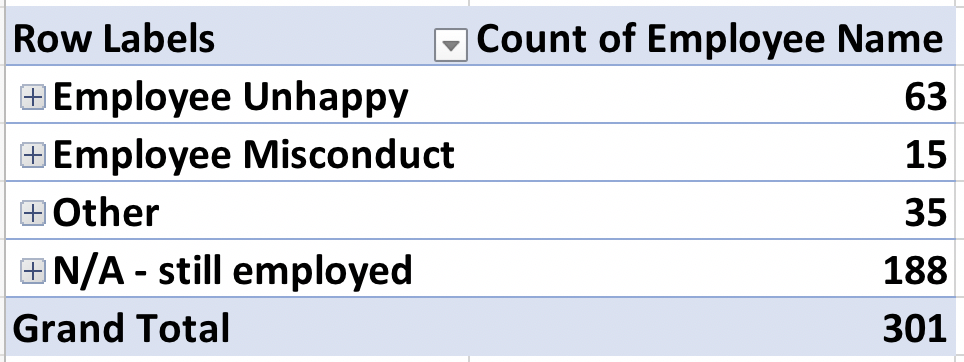
Finally, let’s group everything else except “N/A – still employed” together into a group called “Other”, and then minimize the groups using the small minus signs to the left of the group names:
Notice it aggregates the counts for us when we minimize the groups. So we can interpret this as 63 employees left the company because they were unhappy for some reason or another, 15 were terminated for misconduct, 35 left for other reasons, and 188 are still employed. Your final grouped PivotTable should look like this:
Grouping Dates
Grouping date/time columns is much easier, we don’t have to manually highlight the groups. Make a new PivotTable (I’m going to copy and paste the one we just did and modify it). Remove everything from the rows box and put “Date of Hire” into the rows box. Depending on your version of Excel, Excel might automatically group this for you. That’s what mine did, you can see from the rows box that it automatically grouped the hire dates by year AND quarter (and actually months too as we’ll see in a second, but that’s not as obvious from the rows box):
We can change this grouping by right-clicking anywhere in the first column of the PivotTable. A window now appears! You can see that on my version, it automatically chose to group by Years, Quarters, AND Months because those three options are highlighted. We only want to group by Years, so select only Years and click OK. If yours didn’t automatically group like mine did, you should still be able to follow this same process.
If you want to select multiple items in a list like the one in the dates grouping window, hold down Command on a Mac and click what you want (it’s Control on a PC).
Grouping Numeric Columns
Grouping numeric columns is also much easier, we don’t have to manually highlight the groups as long as we are choosing groups with even intervals. Let’s say we’re interested in grouping our employees in the dataset by pay rate. We want to create a “High” group, a “Medium” group and a “Low” group depending on how they are paid. There are several ways to do this in Excel, not just using grouping, but grouping is usually one of the easiest ways to accomplish this. Make another PivotTable, and put the “Pay Rate” column into the Rows box, and the “Employee Name” column into the Values box to count how many employees have those pay rates:
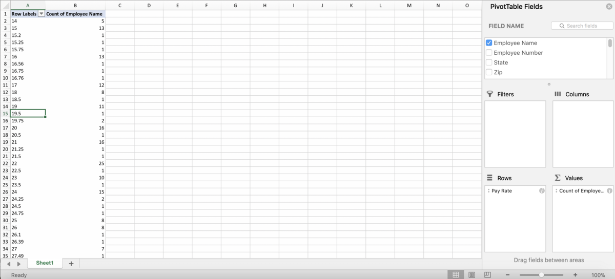
Normally we wouldn’t put a numeric column into the Rows box of a PivotTable, but we’re going to be turning it into a categorical column with the groups. Right click anywhere in the first column of the PivotTable, and choose “Group…”. You should see this window:
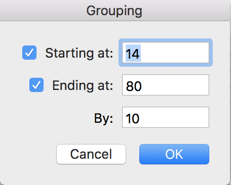
This is telling you that the minimum value is 14, the maximum value is 80, and Excel is suggesting we group by every $10. You can change the minimum and maximum if you want, but we’re going to leave them in this situation. We are going to change the “By” box – instead of grouping by $10, let’s make our groups by $22 so we have three groups that we can then re-name to Low, Medium and High. Put 22 into the “By” box and click OK.
And the result should look like this:
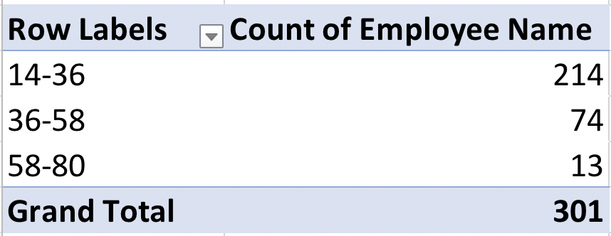
See how the first group is 14-36? 36-14 = 22, so the span is $22. Same for the other two groups. We can re-name these groups by simply clicking on the group title, and using the formula bar to type the name we want:
So what did this accomplish? We can now get a quick count of how many employees fall into each group. Most employees are in the low range (214 out of a total of 301), 74 receive a “medium” rate and only 13 employees receive a high pay rate. Grouping in PivotTables is a quick way to create groups or “bins” of numeric data in Excel without using formulas.
Different Sized Groups In The Same Workbook
Unfortunately, we can’t just change the grouping on the second one. If you do, it will also change the grouping on the first one:
Don’t actually do what’s in this next video, it’s just to show you that it doesn’t work.
As far as I understand, this is because Excel keeps a PivotTable cache. The easiest way I’ve encountered to clear the cache is to copy a grouped PivotTable to an entirely new workbook, ungroup it, re-group it with the new groups, then paste it back in the original workbook. The whole process looks like this:
Make a Histogram
Notice earlier in the post, I said grouping is a quick way to make bins in Excel – bins are what you need for a histogram! There are now many ways to make a histogram in Excel. One is not necessarily better than another, but if you want to customize your bins or make several comparable histograms, grouping will most likely be the fastest way to accomplish this. Let’s see it in action, using the PivotTable we just made with groups of $10. Add the “Sex” column to the Columns box:
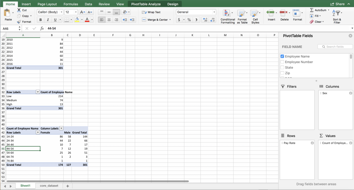
We want to make two histograms that can be compared, one for males and one for females. On the old version of Excel, you could probably highlight the first two columns of the PivotTable to get just the females, but on the new version, Excel will pick up the entire PivotTable as part of your chart. So, we need to use references to copy the PivotTable so that it is no longer a PivotTable, but it’s still connected to the data source. For more information about copying using references, see my Tables and Connecting Data Structures post. But, for now, all you need to do is refer to the top-left cell of your PivotTable (in my case, A42, but yours might be different) in another cell that is a column or two away from your PivotTable. Then, drag that reference down and to the right:
Now, let’s highlight the bins column and the female column, and go to Insert >> Column Chart. Then do the same for the men by highlighting the bins column and the male column. (Use Command on a Mac to highlight columns that are not next to each other. It’s Control on a PC). Remove the gaps (characteristic of histograms) and make sure the axes match since we’re comparing them, and you’re done! The whole thing looks like this:
Takeaways
Congrats! You made it to the end and now can group data in PivotTables! It’s pretty handy, right? You can skip all the nested IF statements and approximate-match VLOOKUPs now, the grouping will do that for you.
<< Previous Post
"Installing & Running Jupyter Notebook"
Next Post >>
"Git Resources"