Analysis of case data for the courtroom.
Sensitive information has been blurred or removed.
Below are pieces of a report completed in Tableau for a law firm. You can get a copy of the modified report as a PDF here. We can also deploy visualizations directly to the web instead of using static images from reports.
This particular file involved a large amount of data, with a lot of particular titles and dates that were important to the case. The attorneys wanted to have easy-to-read visualizations on hand while questioning a witness so that they could quickly tell if the witness was lying about dates or other case details.
Because of the sensitive nature of the data and the need to blur information, these visualizations are published as images instead of an embedded Tableau display, or as the complete PDF report.
Is your organization looking to create Tableau visualizations/dashboards, or utilize its legal data? Chat with us about options:
Case Contracts
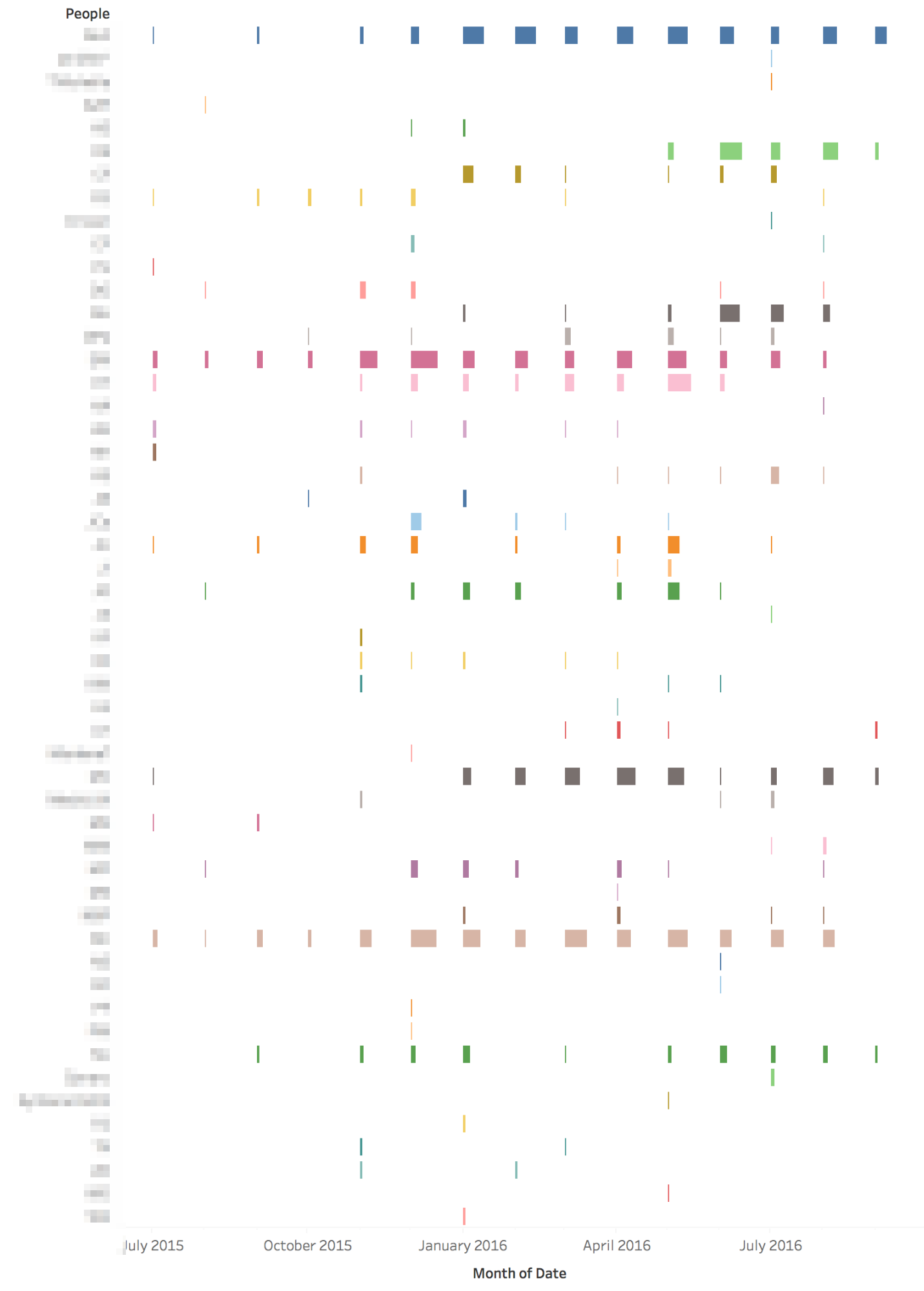
Caption: From this Gantt chart, we see that the “[Contract1]” and “[Contract2]” contracts were mentioned early on in the dataset (they appear to the left of the chart, which is early on the timeline). However, they were only mentioned once (the bar is skinny and the label shows a 1).
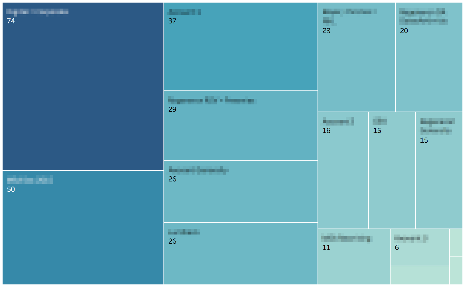
Caption: This tree map shows us the frequency with which each contract was mentioned in the dataset. “[Contract1]” for example, was mentioned the most times (74 total).
People Analysis
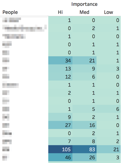
Caption: The heat map shows the number of times each person in the case appears as related to each importance level. For example, “[Person1]” was associated with 34 “Hi” importance notes, 21 “Medium” importance notes and 1 “Low” importance note. Darker colors indicate higher numbers, so you can glance for patterns in the table.
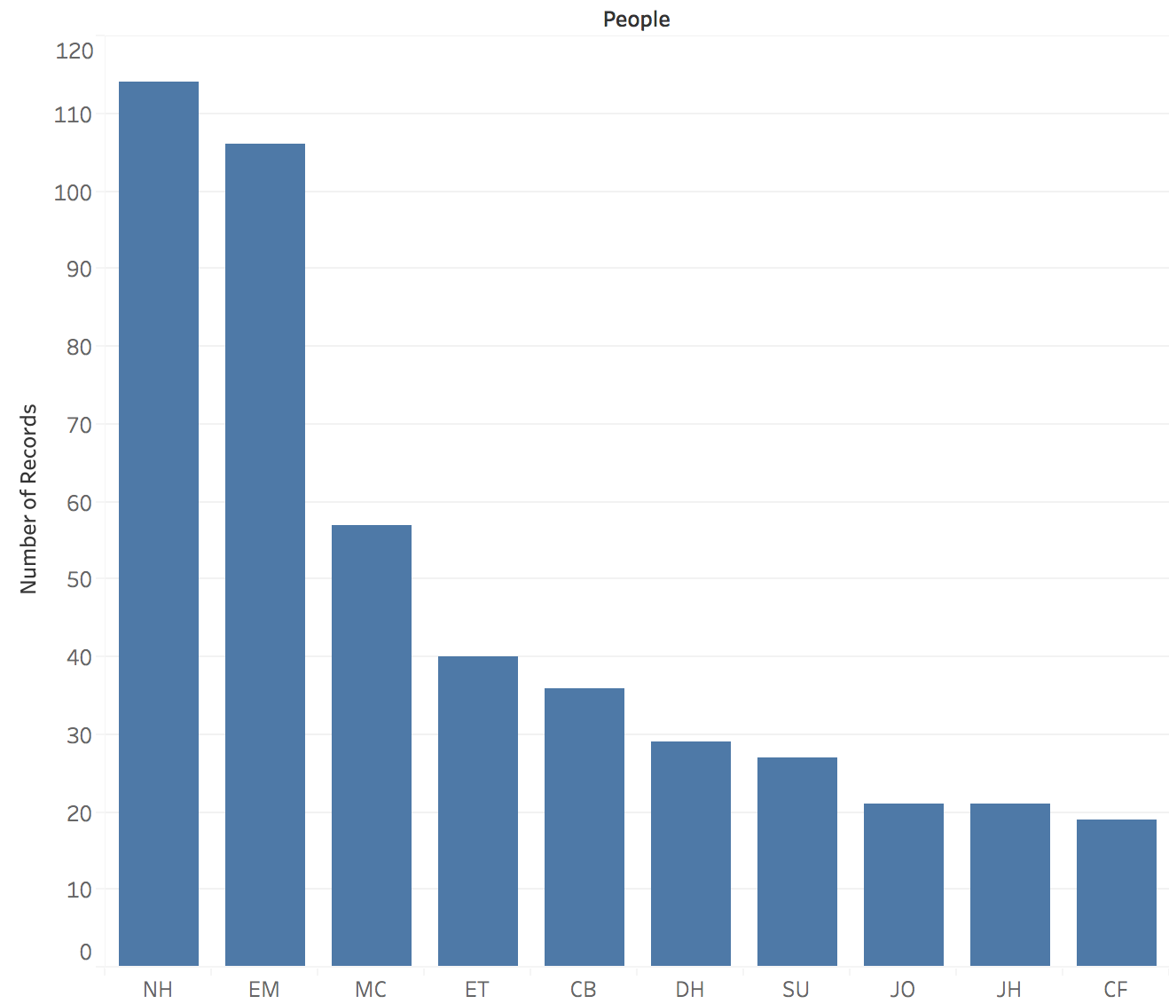
Caption: The bar chart depicts the top 10 people mentioned in the dataset (by the number of times his/her name appears as associated with a note/date).
Importance Analysis
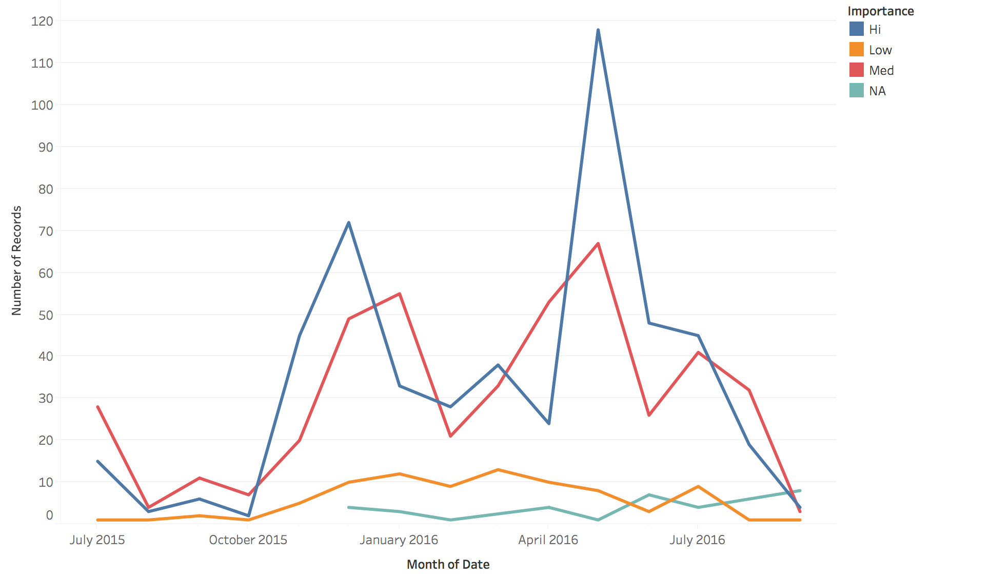
Caption: This line plot shows how many items came up over time by importance level. So for example, we see a spike in “Hi” importance items around May 2016. Low importance items tend to stay relatively consistent over time, with a small increase between January 2016 and March 2016.
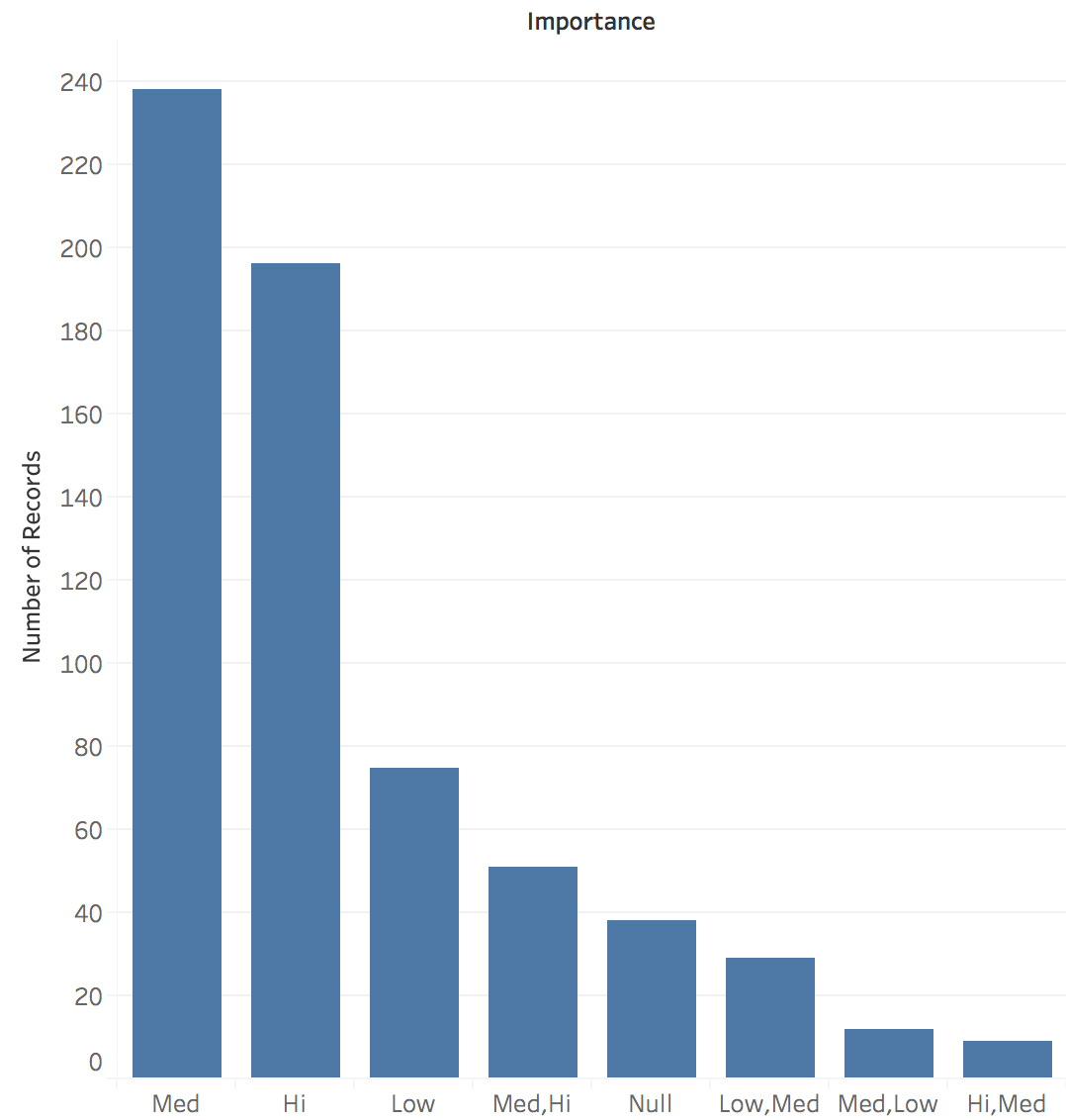
Caption: Some of the items were tagged as two or more importance levels (for example, “Hi, Med”). If we leave the data the way it arrived, the blue bar chart shows the counts of how many of each type of tagging appeared in the dataset.
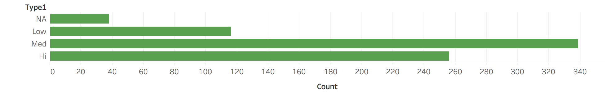
Caption: We cleaned the data so that items with two or more tags were separated out. The new counts are in this green bar chart.
Additional Analyses
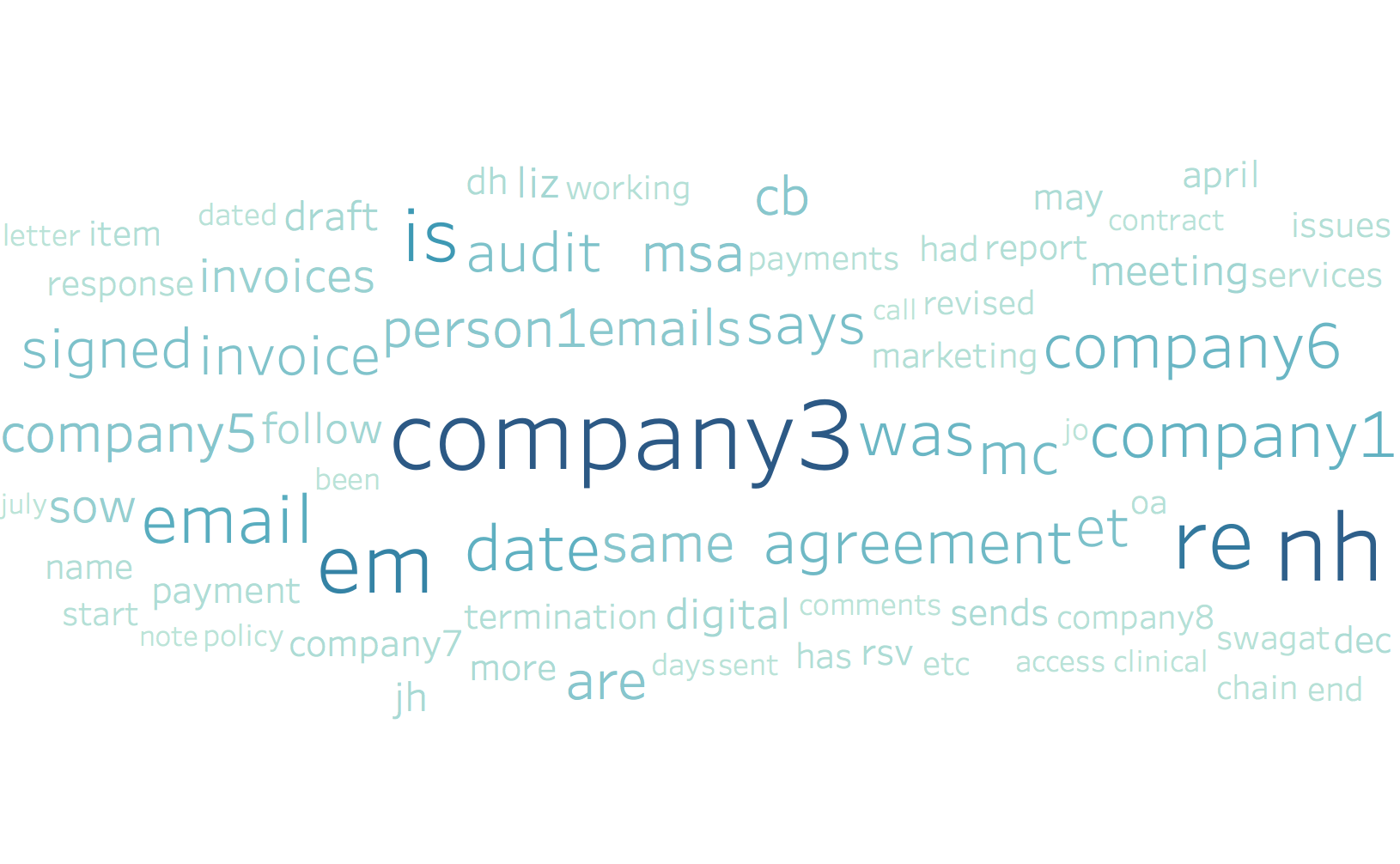
Caption: The Word Cloud depicts the top 75 words that appear the most frequently in the “Facts” column.
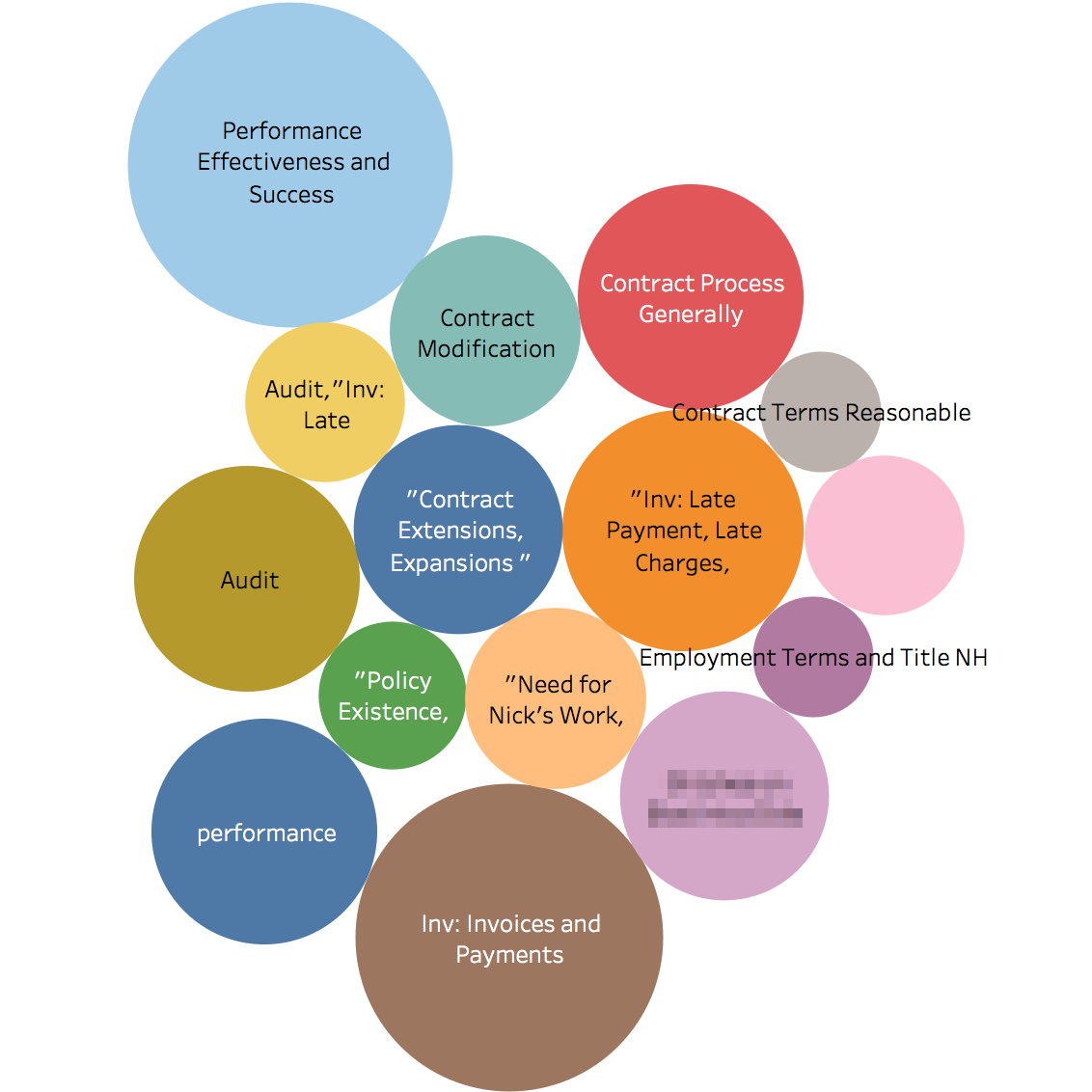
Caption: The bubble plot shows the top 25 issues/codes by the frequency with which they appear in the dataset. Larger bubbles means higher frequency.