Tables & Linking Data Structures in Excel
Tables & Linking Data Structures in Excel
by Boxplot Sep 1, 2019
Tables are one of the most important features of Excel, but are often overlooked. Tables and keeping analyses in Excel connected, will drastically increase your efficiency in Excel. Let’s start by understanding how they work with PivotTables.
We’re going to use an R Dataset called DoctorContacts. Download the .csv file using this link (and save it immediately as .xlsx!). If the file opens in a new window instead of downloading, try right-clicking the link and choosing “Save Link As…”. You can find the data dictionary for this dataset here. Each row represents a unique visit to the doctor.
If you click on any non-blank cell, and then go to Insert >> PivotTable, you should see this:
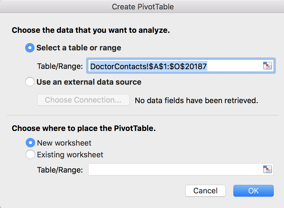
Notice this says DoctorContacts!$A$1:$O$20187. Even if you take away the dollar signs, this range of cells is set in stone. For example, let’s say you actually make this PivotTable, and maybe 10 more PivotTables, and a bunch of charts, and calculations, and perhaps even a whole dashboard. And then after you did all that, your boss comes to you and says “oops, I forgot to give you 100 rows of data.” Or maybe you forgot a calculated column, or data is constantly updating from a server. Depending on what is changing in your dataset, and how you set up your PivotTables, calculations and charts, you may have to re-do everything. But that doesn’t happen if you make a Table first. Click cancel to get out of this PivotTable window, we’re going to make a Table first!
Make a Table
Click on any non-blank cell inside your dataset, and then go to Insert >> Table. Excel will find the dataset for you:
Quick tip: Do not highlight the data before making a Table or PivotTable- if you highlight the data first, you could either 1) get blank cells in your table or 2) miss data. The best and easiest way to select your dataset is to simply click on a non-blank cell inside the dataset, and go to Insert >> Table or Insert >> PivotTable.
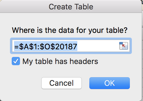
When this window appears, verify that it did find your correct dataset, and that “My table has headers” is checked off. This just means that the titles of the columns are in the first row of your dataset, which they are. Then click OK. Your dataset should have turned blue. This is what the whole thing looks like in case you missed a step:
This is a video, hit the play button!
Besides being easier to read, more importantly, this is now a modifiable data structure. Excel now recognizes this as your dataset. Now, go back to Insert >> PivotTabe. Notice anything different?
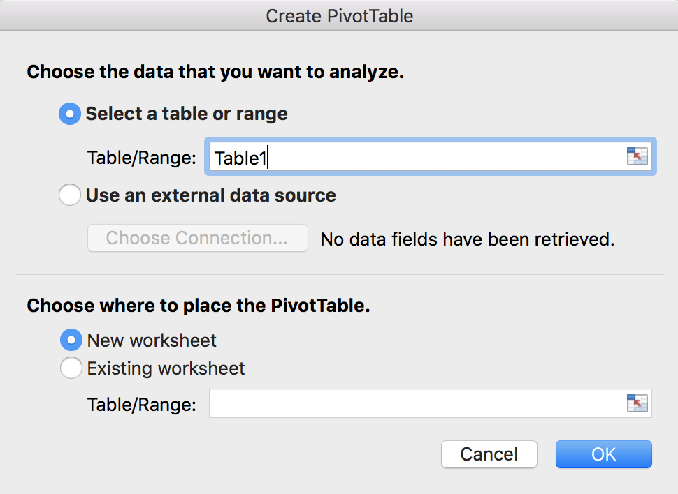
That’s right, now it says “Table1” instaed of “DoctorContacts!$A$1:$O$20187”. You can add or remove rows to Table1, and it’s still Table1. You can add or remove columns from Table1 and it’s still Table1. Now you no longer have to worry about your PivotTable reference if your original dataset changes. Let’s try it out to see it in action. Click OK to make the PivotTable from Table1. Let’s drag health into the rows box, and linc into the Values box. We want the average income by health level, so change linc from a sum to an average. This is what the process looks like:
and the outcome:
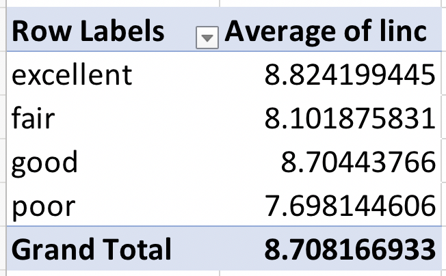
Those numbers look odd, right? People don’t have an average income of $8. This is because this variable represents the log of income. (It’s actually unclear if this is the log, natural logarithm, or some other formula. We’re going to assume it’s the natural logarithm for this analysis). We can get this back into regular income by creating a new calculated column. So, we’ll be modifying the original dataset so you can see how tables work to keep your data updated!
Back in the table, go to the next blank column to the right, and call it “income”. Type “=EXP(” and then click on cell I2. Your final formula should look like this: “=EXP([@linc])”. Notice formulas are easier to read in tables too! This is more like a sentence, and you don’t have to go back and figure out what I2 is later if your columns are named well. Hit enter, and you should see the formula automatically fill down the whole column.
What if I want to freeze part of a cell reference? (Use the $?) There’s a way to do this with the table syntax, involving the @ symbol and brackets []. However, you can also always just revert back to the normal way of referring to a cell (A2 for example) by hand-typing the reference, and then you can use the dollar signs.
Now, go back to your PivotTable. Notice that your new income column isn’t there yet! Don’t worry, all we have to do is go to the PivotTable Analyze menu, and hit the refresh button. Now it’s there! As usual, here’s the whole thing:
Now, we can swap out average of linc for average income and the numbers look a lot better:
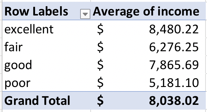
I know these values still don’t look like realistic incomes, but remember we assumed that it was a natural logarithm. The point of this example is that we were able to update the PivotTable using Tables.
An Example with Rows
You can also do the same thing with rows – the PivotTable will recalculate the values when you push the refresh button, and any visualizations that are connected to the PivotTable will also update. Start by making a bar chart from our average income by health level PivotTable. To do this, you shouldn’t have to highlight anything (unless you are on an older version of Excel on a Mac). Just click anywhere inside the PivotTable and go to Insert >> Column Chart:
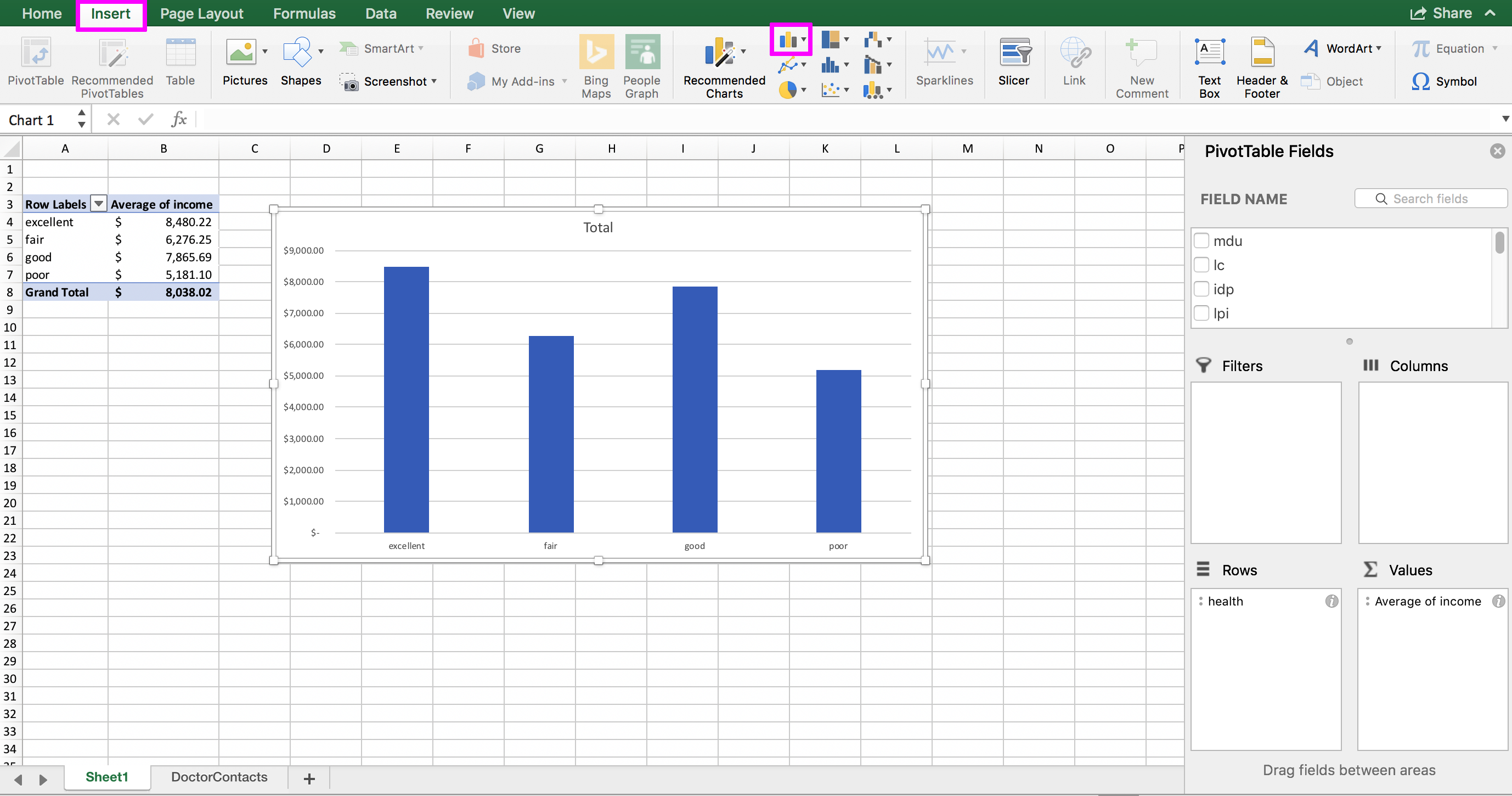
Now, go back to the original dataset and scroll down to the first blank row below the table (should be row 20188). By the way, the keyboard shortcut Command + down arrow key on a Mac will get you to the bottom of the dataset faster. It’s Control + down arrow key on a PC. In that blank row, we’re going to fill in some fake data to see how the update works. Put “poor” in the H (health) column and 1000000 in the P (income) column. You can leave everything else blank. Go back to your PivotTable, and click inside it. Then, in the PivotTable Analyze menu, choose the Refresh button. Notice how the average income for the poor category recalculates, and the bar increases:
No need to re-do the PivotTable or chart. And imagine if you had spent a ton of time formatting the chart (picking out colors, removing borders, etc.) – it would be an absolute nightmare to have to redo that!
Tables are also essential when you have an Excel file that is connected to a server. I’ll cover that in a future post, but if you have data constantly coming in from a server (or being overwritten) then you’ll want a table so that the table expands and contracts with your dataset.
Referencing to Keep Things Connected
What if you can’t make a chart or calculation directly from a PivotTable? For example, most versions of Excel do not allow you to make a bubble plot directly from a PivotTable. No worries, you can still keep things connected with references! Let’s do it together.
In the sheet with your PivotTable, move the chart out of the way, and then click on cell D3. In cell D3, type =A3. Then drag that formula down to D7 and let go. When I say “drag” I mean hover your mouse over the bottom-right corner of the cell until you see the black cross hair (that little square in the bottom-right is called the “fill handle”) and then pull that. Once you’ve got D3 through D7 filled in, keep that range highlighted, and drag it to the right one column. The whole thing looks like this:
This is a way of copying and pasting the PivotTable without breaking the connection, and now the copied cells aren’t a PivotTable anymore. If you build your chart from these references, and something changes in the dataset, the chart will still update. When you hit the refresh button, the PivotTable will change, which will change the references since they just copy whatever is in the PivotTable, and your chart will change when the references change.
We can see it in action by adding a filter to our PivotTable and watching the references and chart update when we change the filter. Add the “physlim” column to the Filters box of the PivotTable. Change the filter from True to False to both and watch how the references change to match whatever is in the PivotTable, and the chart changes too:
Takeaways
Tables are pretty amazing – I make every dataset I get into a table immediately, I’m yet to find a downside. Tables will make your Excel workbook and work flow more efficient, and having to re-do visualizations and calculations when something changes. Make sure all of your future data structures (PivotTables, references, formulas, visualizations etc.) are all ultimately connected to the original table so that your entire workbook will update with the refresh button.
<< Previous Post
"Using DB Browser for SQLite"
Next Post >>
"Common Python Errors"