Histograms
Histograms
by Boxplot Mar 12, 2023
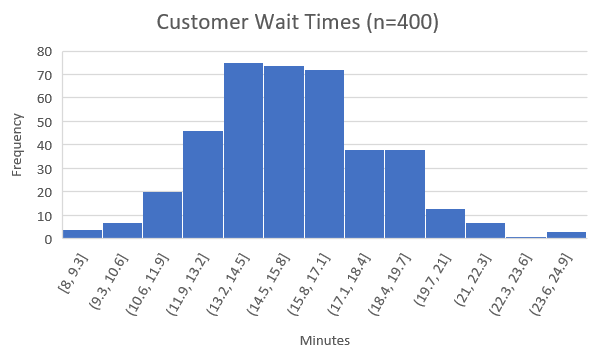
A histogram is a type of bar chart that shows the distribution ―i.e., the probability of a variable being within a certain range of values, out of all possible values― of a certain variable. For example, we can use a histogram to show customer wait times at a restaurant:
This histogram indicates that approximately 4 customers waited between 8 and 9.3 minutes, approximately 6 customers waited between 9.3 and 10.6 minutes, and so on. We can then estimate that because there are 400 total customers in the sample, that the probability of waiting between 8 and 9.3 minutes is 4/400 = 1%, the probability of waiting between 9.3 and 10.6 minutes is 6/400 = 1.5%, and so on for every possible waiting time. Clearly, there is a ton of information that can be inferred from this one simple chart, which is why statisticians find histograms so helpful.
Note that histograms are usually used for continuous variables ―variables that have infinite possible values― and so we divide the set of possible values into equally-spaced ranges, such as between 8 and 9.3, between 9.3 and 10.6, and so on; in our example, it would be impossible to show every possible value for minutes waited because 8 minutes of waiting would be distinct from 8.00001 minutes, which would be distinct from 8.00000000000001 minutes, and so on, so we split up the variable into ranges.

Fun fact For those of you familiar with Bell Curves (also known as a Normal Distribution): “Bell Curves” got their name because they are essentially histograms that are shaped like bells! In fact, if we create a histogram of most random variables, including the one from our example, it comes out looking somewhat like a bell curve.
Creating Histograms In Excel And Google Sheets
The process to create a histogram in Excel is very similar to the process in Google Sheets, so we’ll show them side-by-side in this tutorial. We’ll be using the famous Auto-mpg dataset for this demonstration; if you want to follow along, the dataset is accessible on the UCI website and Kaggle. Feel free to follow along using your own dataset, however.
To start off, remember that histograms are used to visualize a single continuous variable, and so make sure the data you’re trying to build a histogram off of is organized into a single column or row. In the Auto-mpg dataset, the goal would be to build a histogram based off of just one attribute at a time, which would correspond to one column of data; for example, you could build a histogram to display the distribution of mpg, or of cylinders, or of displacement, and so on, but you would almost never build a histogram that involved more than one of these at a time.
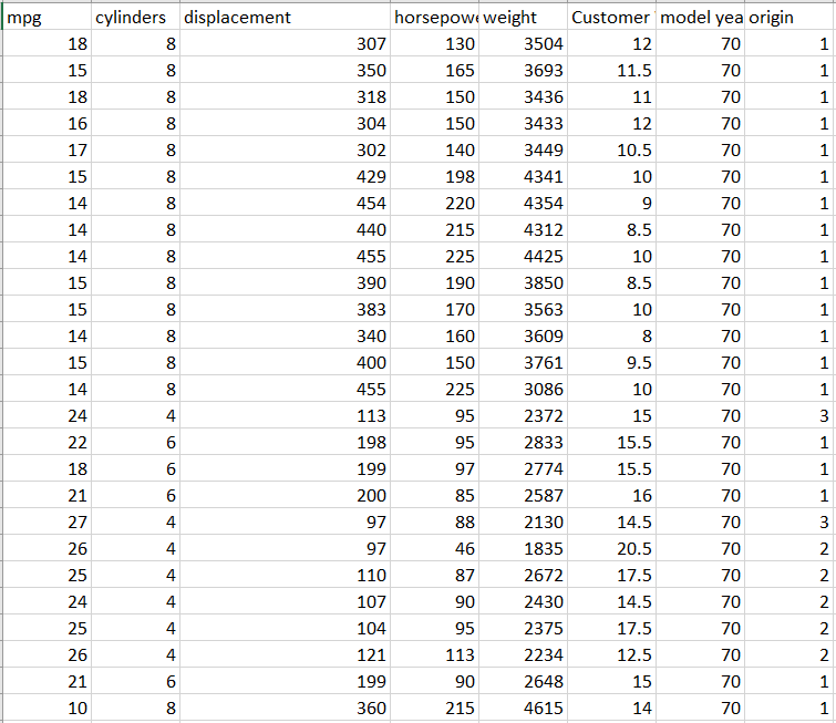
Also remember that histograms are used to analyze continuous variables, and thus it would not make sense to build a histogram for the car name attribute (a “histogram” for a discrete attribute like this one would just be a regular bar chart).
Let’s make a histogram!
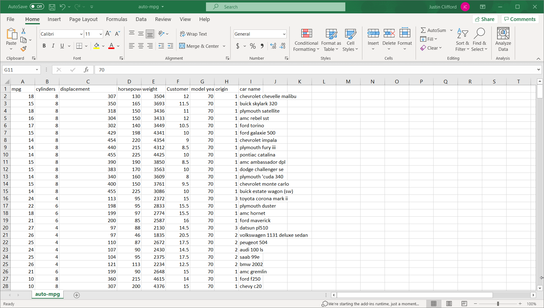
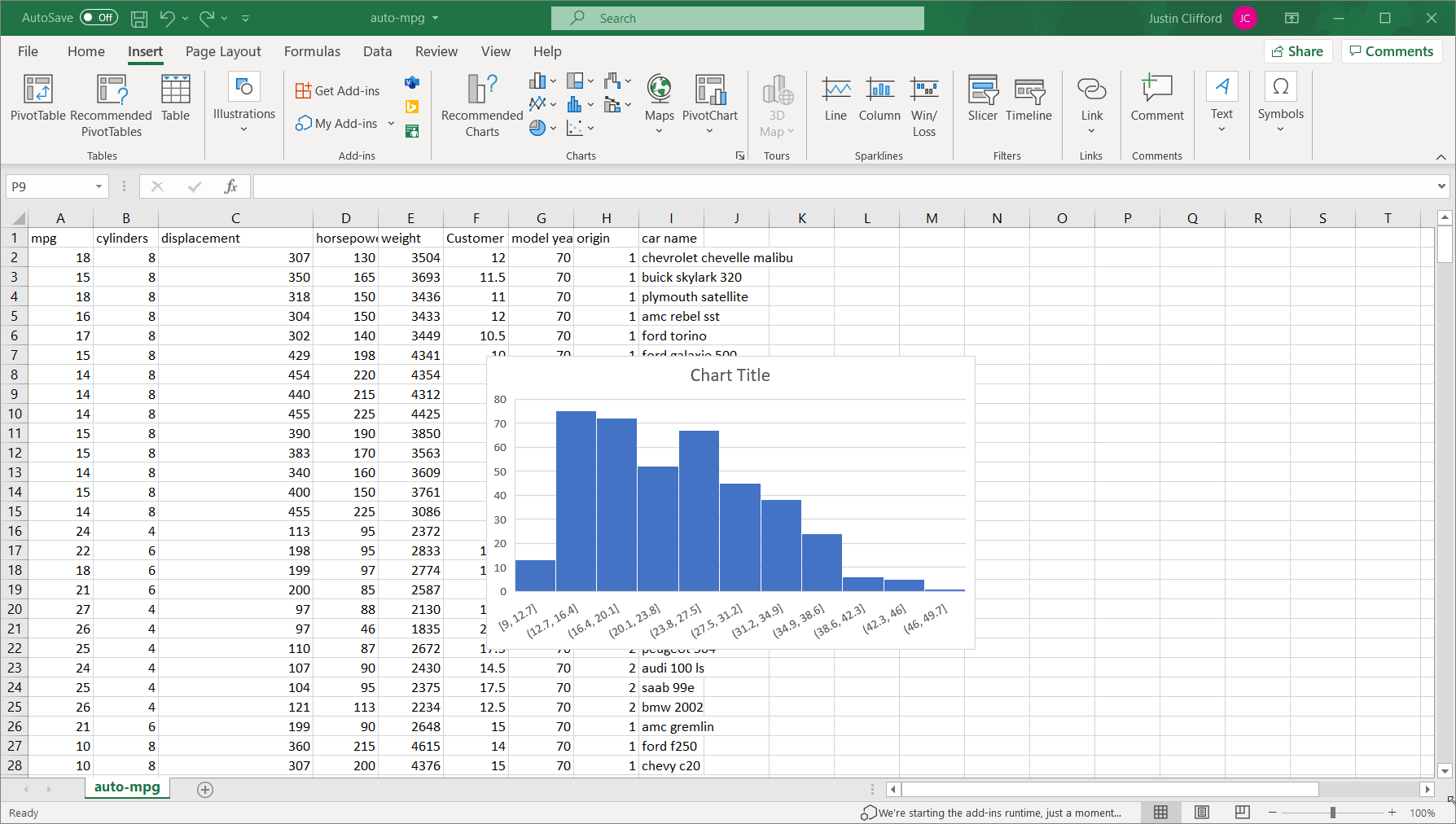
The process is slightly different for Excel than for Google Sheets, so I’ll show the former and then the latter. In Excel, select the entire column of data you want to analyze (I’ll do the mpg attribute) and then go to Insert on the Excel ribbon, and click on the blue bar-chart-looking logo, two buttons to the right of the Recommended Charts button; this button, labeled “Insert Statistic Chart” is used to insert histograms. Finally, click on the option in the top left of the resulting box, labeled “Histogram”:
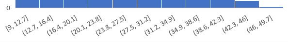
We can see that unlike the previous example, this particular attribute’s histogram is abnormally distributed; that is, the distribution does not follow the symmetric bell curve shape that we saw earlier. In fact, mpg looks to be what we call “right-skewed”, which means it is much more likely for the value of the variable to be towards the lower end of the overall range than towards the higher end.
It’s also worth going over how to adjust what we call the “binning” of the data, which is the way values are grouped into ranges on the histogram; each group is referred to as a “bin”. By default, we have 11 bins in this histogram on intervals of 3.7: (1) between 9 and 12.7, (2) between 12.7 and 16.4, (3) between 16.4 and 20.1, and so on:
By right-clicking on the values across the x-axis and then clicking Format Axis, we open up the side-bar that can be used to alter the binning of the data:
Under Axis Options on that toolbar, we have several options for binning. By default, the binning is set to Automatic, but we can also set it to:
- By category. This option is not relevant to single continuous variables such as mpg.
- Bin width. This option allows us to customize how wide each bin is. It is set to 3.7 by default, but if we were to set it to 7.4 for example, we would only have half as many bins. In general, the larger a bin width you choose, the fewer bars there will be in the histogram, and vice versa.
(Figure 6 *Note – animation has a 2-3 second delay.)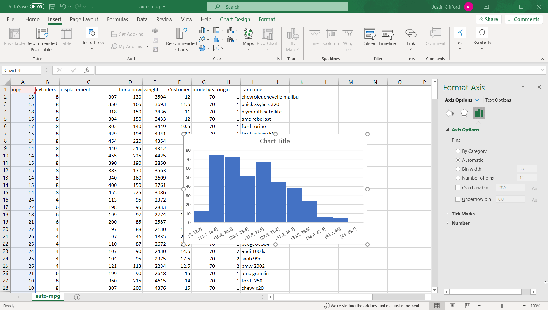
- Number of bins. This option allows us to customize the binning based on the total number of bins. It is set to 11 by default, but if we were to set it to 22, the range for each bin would decrease by half. The same process for using the Bin width option also applies to this option.
There are also the overflow and underflow bin options, which allow us to group all observations above and below a specific value, respectively, into a single bin. Take some time to play around with the optioning on your own until you are satisfied with the result.
To create the same histogram in Google Sheets, again select the column of data and go to Insert on the ribbon, but then click on Chart. A scatter plot will then appear by default; change this chart to a histogram by changing Chart type to “Histogram chart”:
The binning is editable by clicking on the three dots in the upper right-hand corner of the chart, and then clicking Edit chart. The chart editing toolbar appears, and then go to Customize and click into the Histogram section:
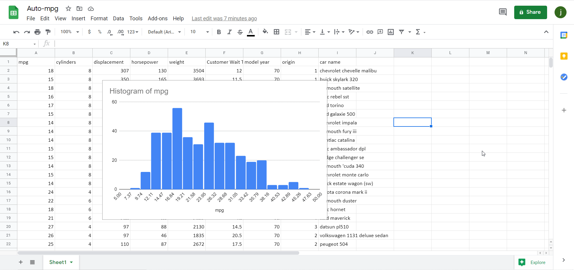
There aren’t as many binning options in Google Sheets as there are in Excel as you can see, but there are two:
- Bucket size. This option is similar to the Bin width option in Excel, although it only lets us choose the sizes from a dropdown instead of letting us customize it fully (as it does in Excel).
- Outlier percentile. This option allows us to determine the percentage of overall values that are grouped into the two outermost bins. In that sense, it is similar to the overflow/underflow options in Excel; however, Google Sheets only lets us group values into these outermost bins at preset percentiles (unlike Excel), and we are forced to use both an overflow and underflow bin, but we can’t use one or the other exclusively as we can in Excel.
Histograms can be made in Excel, Tableau, Power BI, and any major analytics program or language. If your organization could use help harnessing the power of its data, contact us.
<< Previous Post
"Boxplot Makes List of 64 Best Pennsylvania Database Startups"
Next Post >>
"Conditional Formatting with Excel"