Line Graphs
Line Graphs
by Boxplot Apr 1, 2023
What Is A Line Graph?
A line graph is a series of data points on an x–y axis, connected by a line. There are two kinds of line graphs: colored-in (also known as area charts) and standard. While the area under the line of a colored-in line graph is shaded in, the area under a standard line chart is not.
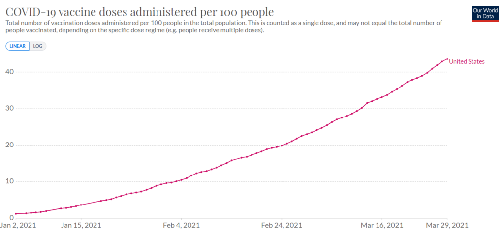
Standard chart
Area chart (colored-in)
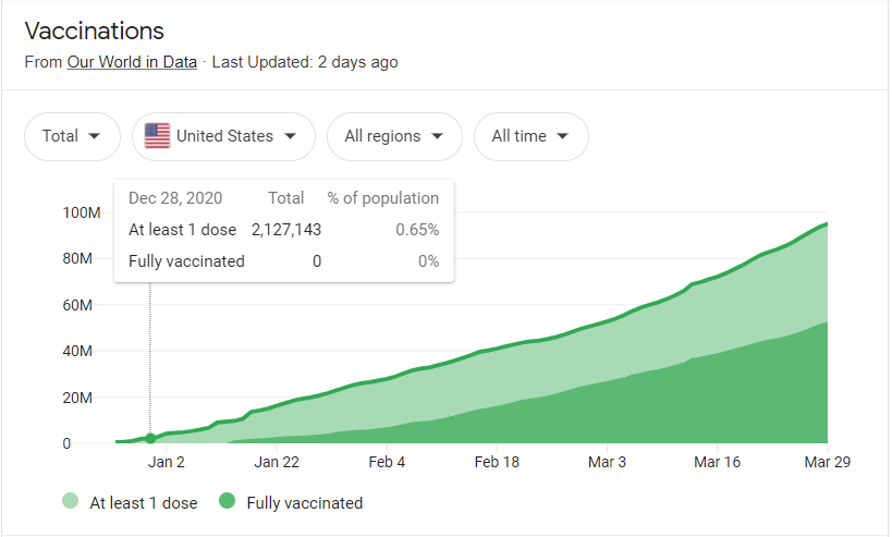
Within area charts, there are two types: stacked and proportion of whole. Stacked area charts simply show the series as-is, such as the area chart immediately above; proportion of whole area charts show an entire population ―represented by 100%― split up into the proportion of that population that each group represents. It’s easy to differentiate between the two types of area chart by the fact that the uppermost line on a proportion of whole area chart is always flat at 100%, while that of stacked area charts varies over time. Area charts are not recommended by some data visualization experts because their data points can be hard to compare and misleading.
When To Use Line Graphs
Because line graphs convey the progression of a series of data very well, it is most common to see line graphs being used to display information over time. You’ll occasionally see line graphs represent distributions (what is the frequency of each possible value for a data set) but time series are definitely the most common. In terms of choosing between standard line graphs and area charts, it is more common to use an area chart if you want to compare different groupings of the same series/population ―e.g., if you want to compare the number of people who have gotten at least one dose of the coronavirus vaccine with the number of people who are fully vaccinated, as seen above― but much more common to use a standard line graph if you want to see a single metric, such as the first example graph shown. A standard line graph is also common if you’re looking at multiple different series (not to be confused with different groupings of the same series), e.g., if you want to compare how many people have been vaccinated in the United States vs. the number of people vaccinated in Canada.
Common Programs For Making Line Graphs
Likely the most commonly-used program to make either type of line graphs is Excel; beginner and expert data analysts alike love Excel’s ease of use, flexibility, and universality. However, other business intelligence software which can be used to make any type of line graphs include Tableau, Qlik, and Microsoft’s Power BI (which are each superior to Excel in terms of automation and customizability) as well as Google Sheets. Additionally, programmatic tools such as R and Python each include packages for creating line graphs.
Tutorial: Making Line Graphs In Excel
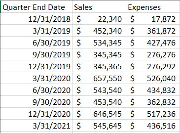
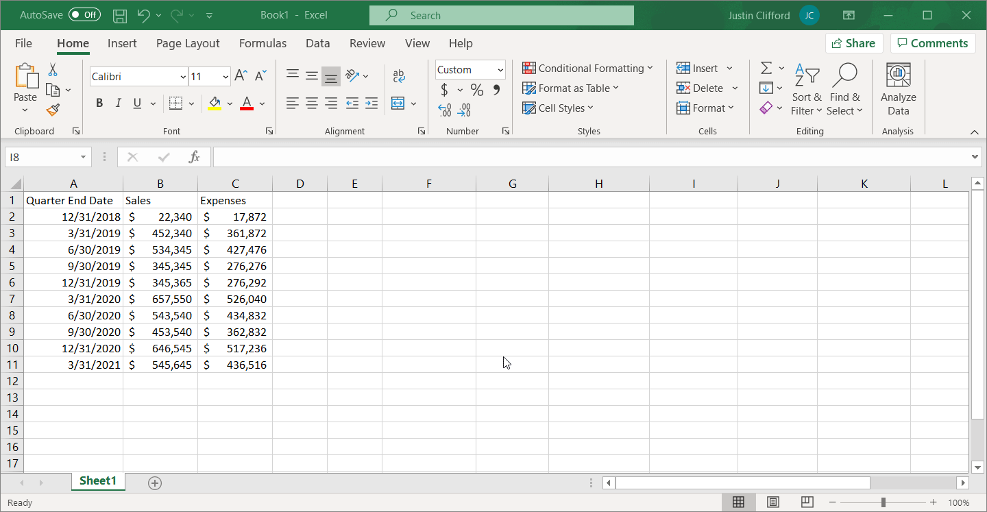
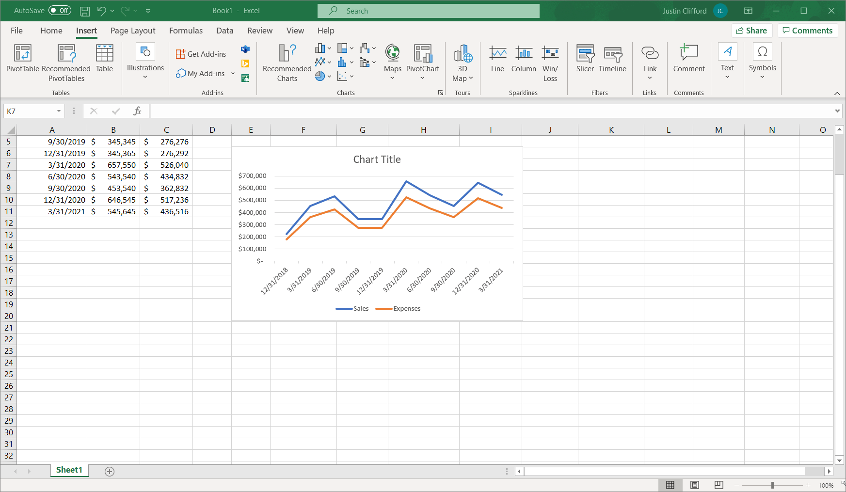
Although there are a number of different programs in which you can make line graphs, I’ll do a quick tutorial here in Excel since that’s the most popular. To start, organize your data into adjacent rows or columns, where one of those rows/columns contains the data to appear on the x-axis (this is usually a row/column of dates), and the other row(s)/column(s) correspond to the values that you want to appear in your chart. For example:
It would also work just as well to have the three categories of data as rows instead of columns:

While it isn’t absolutely necessary for the rows/columns of data to be adjacent, it will make the process of creating the line chart much easier; you’ll see why in a second. Note that any of the values in these rows/columns of data can be calculated by Excel formula(s) or hardcoded (raw) values. However, formulas are preferable if possible because when a calculated value is updated, it’ll also update the graph that shows that value automatically; this is not the case with hardcoded values, on the other hand.
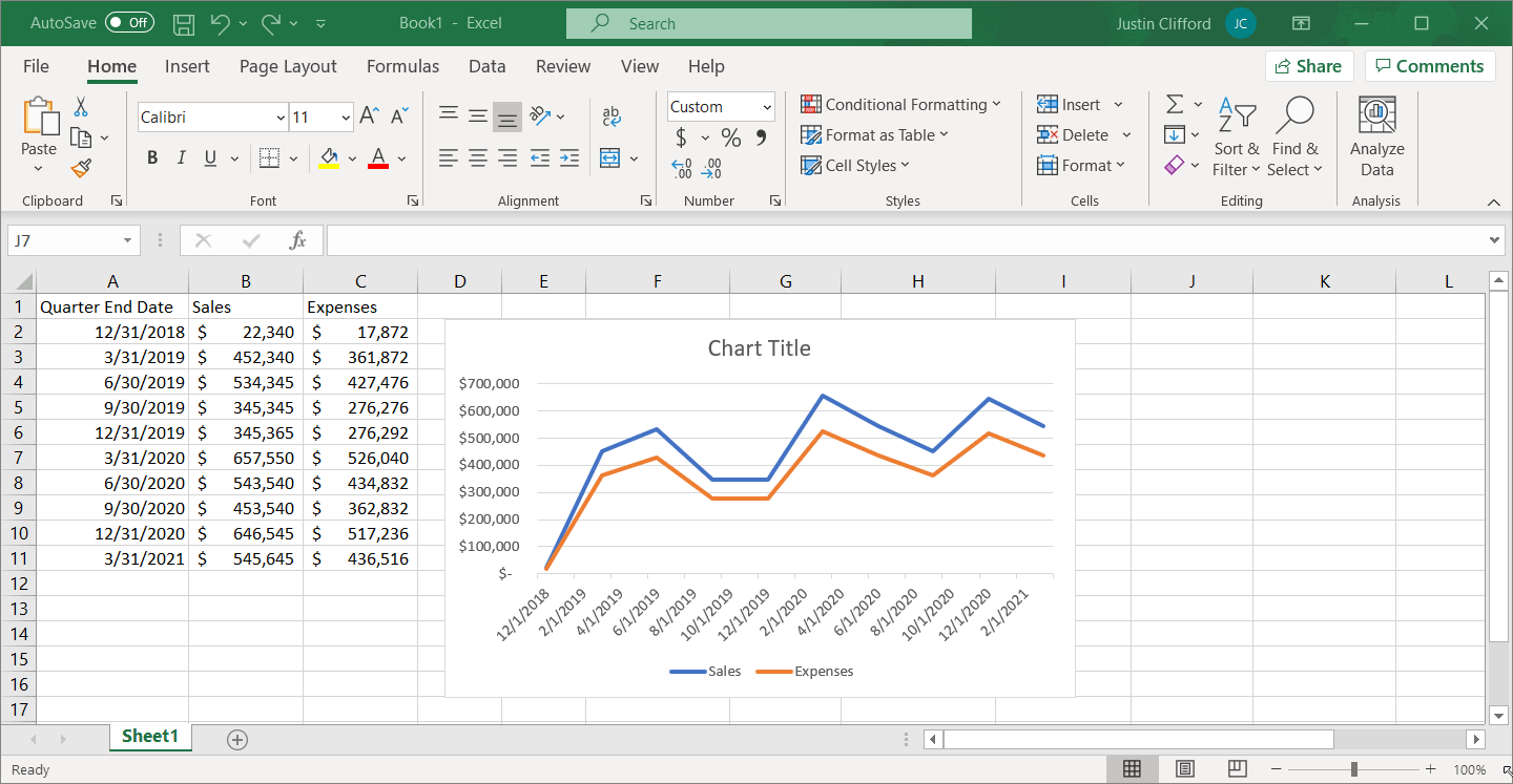
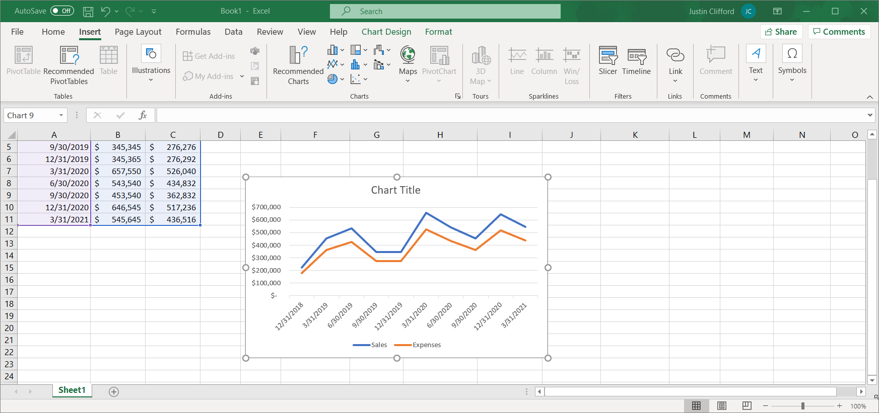
To create your line graph, highlight the data, and then go to Insert and click on the line graph icon:
You’ll also see the stacked line and 100% stacked line options alongside the standard line chart option, and creating those two types of chart works the same way. However, in this context, the standard line chart makes the most sense. Using Excel’s Recommended Charts option will also give you a line chart by default as it assumes a line chart is desired for time-series data.
To customize the title of the line chart, simply click into the title box at the top of the chart and type in the desired title:
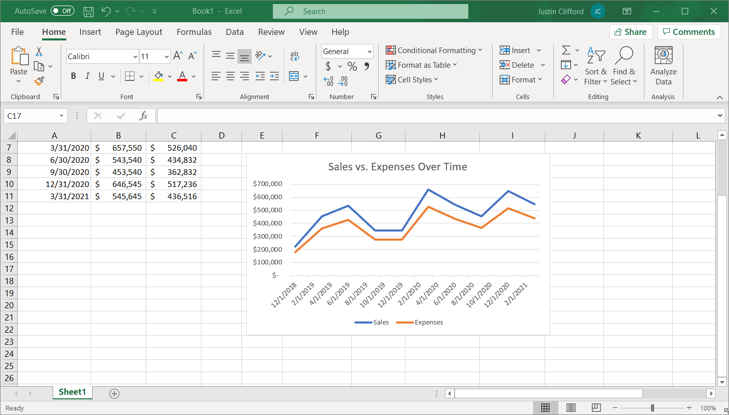
I can also change the font and formatting of the title in the same way.
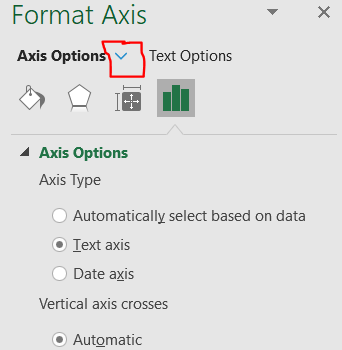
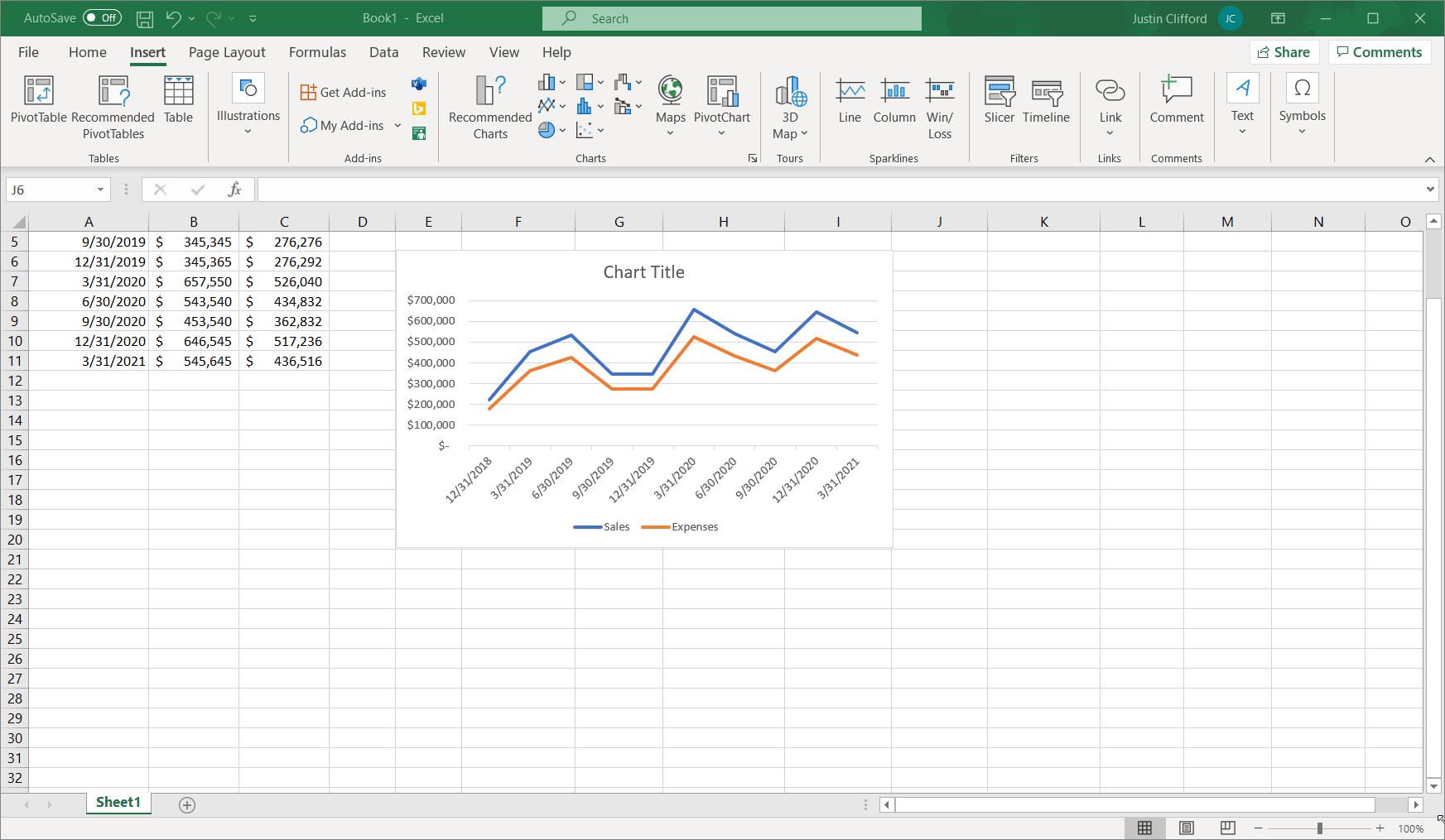
There’s a small issue with this chart that we need to adjust: the x-axis starts at 12/1/2018 even when my data doesn’t begin until 12/31/2018. To customize my x-axis ―or any other chart component, for that matter― right click on the axis, and then select Format Axis. Next, set this axis type to a text axis (Excel thinks of dates such as 12/31/2018 as month dates that simply correspond to December 2018, and thus records them on charts as 12/1/2018 by default instead of 12/31/2018):
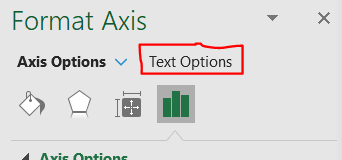
There are nearly countless other customization options available to you on this same toolbar that you just used to adjust the x-axis. To access the other options, click on the down arrow next to the Axis Options label:
Here, you have the ability to edit the chart area, chart title, horizontal axis, vertical axis, legend, plot area, and series, in terms of size/properties, effects, fill/line, and/or axis. For items corresponding to any sort of text label, the Text Options button also appears:
I won’t go into too much detail on all these options as doing so would take a VERY long time, but know that nearly any customization feature imaginable is available somewhere in these options.
While you’re at it, let’s go through the other customization options to make sure the line graph is exactly as you desire. If you click on your chart, you’ll see three icons on the top right corner:
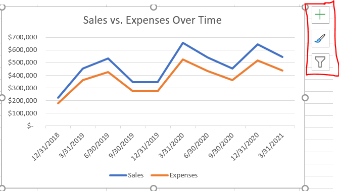
The plus icon controls which elements you want to show up on your line chart. By clicking on this icon and hovering over each checkbox, you can view what your chart will look like with each option selected or unselected in real time; the arrows you see on the right side point you to additional toggle options:
You can use this feature to add or remove the axes, axes titles, the chart’s title, labels for each individual data point, a data table, error bars (showing standard error, percentage, standard deviation, etc. for each individual data point), gridlines, a legend, a trendline ―although that wouldn’t make very much sense in the context of a line graph― and up/down bars which show differences between the two series.
Next, the paintbrush icon allows you to change the visual styling of the line graph. Take some time to play around with the different options it gives you for style and color, and see which one you like best:
Note that more color options are available; the ones you see on this tab are just a few preset out-of-box options.
Lastly, you have the funnel icon, which lets you filter which data you do and don’t want to appear on your graph. You can even remove an entire series from the graph this way, or remove one of the dates along the x-axis; control these two options by checking/unchecking boxes, and then click Apply to see the results:
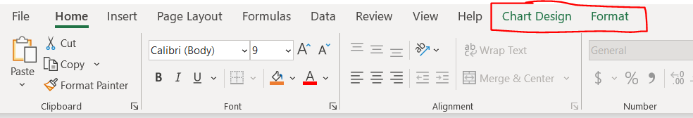
When you click on the graph, you may have noticed two extra tabs on the Excel ribbon that aren’t normally there: the Chart Design and Format tabs:
Let’s briefly go over those two tabs as well. On the Chart Design tab, the first three dropdowns (Add Chart Element, Quick Layout, and Change Colors) as well as the scroll menu in the center of the tab, give you some options that are duplicates from the plus and paintbrush icons explored earlier. Hovering over any of these options will show you what the chart will look like in real time. To reiterate, these are preset options, and if you don’t see something within these options that you want, chances are good you’ll be able to access the desired customizations in another way. There is also the option to switch row and column ―although for line graphs time always goes on the x-axis―, to update the selection of data that goes into the graph, to change the type of graph that displays, and to move the chart to another sheet in the Excel file.
Finally, there’s the Format tab, which replicates a lot of the functionality present on the toolbar that you used to adjust the x-axis. Take some time to play around with the options.
Summary
- Line graphs are used to show the progression of a series of data, usually over time. An area chart is used if the series is being split up into multiple groups, but if it is not being split up, a standard line graph is more common.
- Excel, Google Sheets, Power BI, Tableau, Qlik, Python, and R all include packages for building line graphs.
- There are countless options for customizing your line graphs in Excel. Review the tutorial in this blog post, or spend some time playing around with the functionality to build your optimal line graph.
<< Previous Post
"Tips For Building Likert Surveys"
Next Post >>
"Small Business Social Media Metrics"